Web design, which is always evolving, offers a variety of styles ranging from classic to avant-garde. We will discuss some of the popular styles for web page design, evaluating them based on the following criteria:
- Popularity: Determined by the frequency of use in web design projects and market demand.
- Trend: Reflects its recent growth and adoption in the field of web design.
- Versatility: Measures how adaptable a style is to different contexts and types of websites.
- Ease of Implementation: Assesses how easy it is for developers to apply a design style.
- Accessibility: Considers how easy it is for all users, including those with inabilities, to interact with design elements.
- Usability: Focuses on the efficiency, effectiveness, and user satisfaction when interacting with the design.
- Adaptability: Evaluates how a design adjusts and looks on different screen sizes and devices.
We have ranked the list according to each one’s total score.
1. Minimalist Design
Minimalist design is a style based on simplicity and the principle of “less is more”. It is characterized by limited color use, simple shapes and lines, ample white space, and uncomplicated functionality. Minimalism is very popular in web and mobile app design, aiming to create a clear and fluid user experience.
2. Material Design
Material Design is a design language created by Google in 2014. The concept is simple: simulate physical interactions and the aesthetics of materials in the real world. Instead of just colors and shapes, Material Design plays with depth, lights, shadows, and movements to give interface elements a three-dimensional look.
Material Design can be used in both web apps and websites. Google provides tools and resources like Material-UI with predefined and stylized components ready for use.
3. Flat Design
Unlike Material Design, Flat Design is characterized by its simplicity and minimalism. It forgoes shadows, gradients, and three-dimensional effects in favor of bright colors, simple icons, and clear typography. Flat Design focuses on functionality and clarity.
This style can be used in both apps and websites. Several templates and libraries online facilitate its implementation, such as Ant Design. Working with Flat Design requires a solid understanding of color, typography, and interface design.
4. Dark Mode Design
Dark Mode design has become increasingly popular in recent years, especially with the introduction of dark modes in various operating systems and applications. This style uses dark backgrounds with light-colored text and other elements, which can be less tiring for the eyes in low-light environments.
5. Card-based Design
Card-based design organizes information into individual ‘cards’, each representing a unique piece of content. This style has become very popular due to its flexibility and effectiveness on various screen sizes.
6. Modular Design
This style is based on the idea of creating a user interface using components or modules. Each module is a standalone unit that can be used and reused in different parts of an app or website. This approach can improve design consistency and efficiency.
7. Data-Driven
Design Data-Driven Design focuses on presenting information in an easy-to-understand manner. This style uses graphs, tables, bar charts, and other visual data representations to convey information effectively. It’s particularly useful for websites and apps that need to present a large amount of data.
8. Big Data Design
Big Data Design refers to the use of vast amounts of data in interface design. This style may include interactive graphics and data visualizations and is especially useful for apps and websites that require presenting complex data in an easy-to-understand manner.
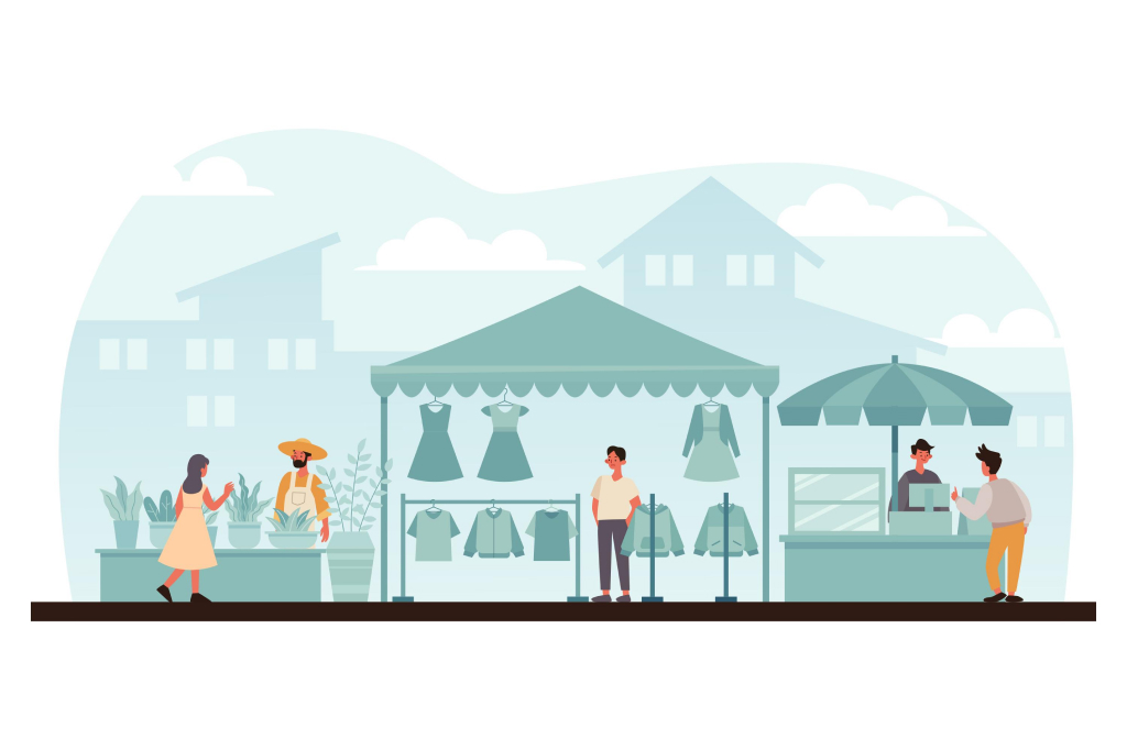
9. Illustrative Design
Illustrative design is a style that uses custom illustrations and graphics to enhance the user interface. Unlike other styles, it focuses on using art and creativity to make interfaces more appealing and memorable. Illustrations can be used in a variety of contexts, from icons and buttons to background images and animations.
10. Typographic Design
This style mainly focuses on typography as the primary means of communication and design. While typography is always a key design element, in typographic design, fonts, size, spacing, alignment, and color are used creatively to create visual and emotional impact. It can be used in both apps and websites to convey a range of moods and styles.
11. Neumorphism
Neumorphism is a relatively new design style that combines features of Material Design and Flat Design. It’s characterized by the use of soft light and shadow effects to give the illusion of elements seeming to emerge or be embedded in the background surface. This creates a sense of depth and touch without losing the simplicity of Flat Design.
Implementation requires a good understanding of lights, shadows, and colors, and there are several online generators, like Neumorphism.io, to assist in creating this style.
12. Glassmorphism
Glassmorphism is a relatively new design trend that uses transparencies and background colors to mimic the look of frosted glass. This style relies on blur effects and transparency to create the sensation that interface elements are made of glass. While its implementation can be challenging due to the need to correctly handle blur and transparency effects, several tutorials and guides are available online to assist this process.
13. Large Font Design
Large Font Design refers to the use of large typography as a dominant design element. This style can be visually impactful and can help focus the user’s attention on key messages or content.
14. 3D Design
3D Design has become a popular style in website and app design. This style creates a sense of depth and realism and can be used to create engaging interactions and animations, from icons and graphics to fully three-dimensional environments, the possibilities with 3D Design are virtually endless.
15. Gradient Design
This style uses color gradients to create a visually appealing design. Gradients can be used to add depth, make certain elements stand out, or simply to add some color and vibrancy to a design. Gradients can be used on anything from backgrounds to buttons and navigation bars.
16. Liquid Design
Liquid Design is a visual style that mimics the fluidity and movement of water. Visual elements have soft edges, fluid shapes, and animations that make them appear to be in constant motion. This style can be used to create visually exciting and dynamic websites and apps.
17. Cinematic Design
Cinematic Design seeks to create striking visual experiences reminiscent of cinematography. This style can include full-screen images, intensive use of video and high-quality images, and sophisticated transitions and animations.
18. Duotone Design
Duotone design is a style that uses two colors throughout its user interface. This technique can result in a visually striking design and can help focus the user’s attention on specific areas.
19. Biomorphic Design
Inspired by nature and organic life, Biomorphic Design uses curved shapes, natural patterns, and nature’s colors. This style can be used to create websites and apps that are more user-friendly and welcoming.
20. Brutalist Design
Inspired by brutalist architecture, Brutalist Design on the web has gained popularity for its “less is more” approach. Stripped of unnecessary frills and styles, it focuses on functionality and simplicity. Brutalist design often includes a monochromatic color palette, large and bold typography, and a rigid grid layout.
21. Maximalist Design
Maximalism is the response to minimalism. This style is characterized by the excessive use of design techniques and elements. Complex patterns, intense color use, excess decorations, and visual elements are key components of maximalist design. This style can be used to create website and app designs that are impactful and capture the user’s attention.
22. Anti-Design or Ugly Design
Anti-Design or Ugly Design is based on breaking traditional design rules and conventions. This style uses garish colors, fonts that are hard to read, and other elements that would normally be considered “bad” in design terms. Despite its name, Ugly Design is used intentionally to challenge expectations and grab attention.

