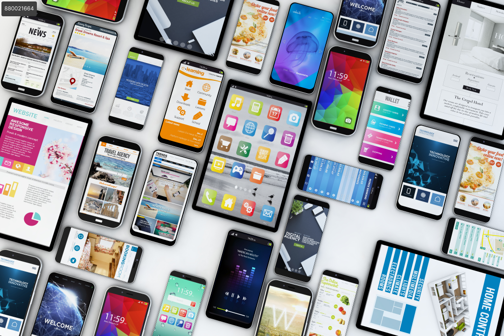
What is Responsive Web Design?
Responsive web design is an approach to creating websites that automatically adapt to different resolutions and screen sizes. Instead of creating multiple versions of a website for specific devices, responsive design uses techniques and technologies that allow a site to adjust and look good on any device, whether it’s a mobile phone, tablet, laptop, or desktop monitor.
Advantages of Responsive Web Design:
- Enhanced User Experience: By adapting to the user’s device, responsive web design provides an optimal browsing experience, resulting in greater user satisfaction and engagement with the site’s content.
- Improved SEO: Search engines like Google prefer responsive websites because they offer a better experience for mobile users. This can help improve search engine rankings.
- Simplified Maintenance: Having a single website that adapts to different devices simplifies content maintenance and updates since there is no need to manage multiple versions of the site.
How to Achieve Responsive Web Design in WordPress
WordPress offers several options for creating responsive web design using visual builders like WPBakery and Elementor. Let’s see how to do it with each one:
1. WPBackery:
- Select a responsive template: When choosing a template in WPBakery, make sure it is compatible with responsive design. You can filter templates based on their compatibility or specifically search for those designed for mobile devices.
- Responsive design options: WPBakery offers several options to make elements responsive. When selecting an element, you will see tabs like “Design Options” or “Responsive Options”. These tabs allow you to adjust the properties of the element on different devices.
- Dimension adjustment: You can set different dimensions (width and height) for the element on different devices. For example, if you have an image element, you can specify that it has 100% width on mobile devices and a smaller width on desktop devices.
- Alignment and position: You can control the alignment and position of the element on different devices. For example, you can vertically center a text block on mobile devices and align it to the left on desktop devices.
- Visibility options: WPBakery allows you to hide or show elements on different devices. This is useful when you want to display or hide specific content based on screen size. For example, you can show a button on mobile devices and hide it on desktop devices.
2. Elementor:
- Choose an Elementor-compatible theme: When selecting a theme for your website, verify that it is compatible with Elementor and is responsive. You can find themes specifically designed to work well with Elementor and be responsive.
- Responsive design options: Elementor offers specific options for responsive design in its editing panel. You can find it on the left side of the screen, where you will see tabs like “Responsive” or “Advanced”.
- Column and section adjustment: You can control how columns and sections behave on different devices. For example, you can change the number of columns in a row for mobile devices or adjust the column sizes to fit different resolutions.
- Visibility options: Elementor allows you to show or hide elements on different devices using the “Visibility” feature in the “Advanced” tab. You can set conditions to show or hide elements based on the device type, such as “mobile” or “tablet”.
- Preview on different devices: Elementor allows you to see how your design will look on different devices while editing. At the bottom of the editing panel, you will see icons for mobile devices, tablets, and desktops. You can click on them to see how your design adapts on each device.
Image Optimization
Image optimization is essential to ensure fast performance and efficient loading on mobile devices. Here are some tips for optimizing your images in WordPress:
- Use Image Compression Tools: Before uploading images to your website, compress them using tools like TinyPNG, JPEGmini, or image compression plugins available in WordPress. This will reduce the file size without significantly impacting visual quality.
- Specify Appropriate Dimensions: When inserting images on your website, make sure to specify the correct dimensions in pixels. This prevents the browser from resizing the image and speeds up page loading.
- Use Suitable Image Formats: Choose the appropriate image format based on the image type. Generally, use JPEG format for photographs and PNG for graphics or images with transparency. Avoid using GIF format for large images as it can occupy a lot of space.
Media queries
Media queries are a fundamental part of responsive design as they allow you to apply specific CSS styles for different screen sizes. Here are some tips on using media queries in WordPress:
Use Custom CSS Styles: In your WordPress theme or customization area, you can add custom CSS styles using media queries. For example, you can adjust font size, margins, or element layout for different resolutions.
Testing on Different Devices
Before concluding, thorough testing on different devices and screen sizes is essential to ensure that your responsive web design functions correctly. Here are some considerations when conducting tests:
- Test on Real Devices: In addition to using online tools, it is advisable to test your website on real devices, such as mobile phones, tablets, and desktop computers. This allows for a more accurate experience and helps detect device-specific issues.
- Verify Adaptability: Ensure that the elements on your website adjust correctly to different screen sizes. Check that the content is legible and that there are no overlapping elements on smaller devices.
- Interaction and Navigation: Test the functionality and interaction of your website on different devices. Verify that buttons, links, and forms are user-friendly and that navigation is smooth across all resolutions.
- Performance and Loading Speed: Evaluate the performance and loading speed of your website on different devices. Ensure that images are optimized, loading times are fast, and there are no performance issues that could affect the user experience.